Jetpack Compose - Configuring a Simple Multi Toggle Button

While working on a filter dialog for my app, I wanted to have a simple control to toggle between different selections. My first thought was to use a radio button, but I wanted to save the vertical space for my filter dialog by leveraging a horizontal control without the need to use additional space for the radio buttons. Also, radio buttons are so old school and not modern IMHO.
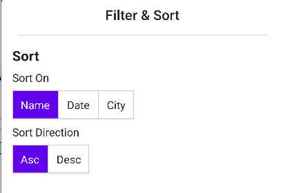
Here is a screenshot of the filter dialog that uses the multi toggle button component. Also, I think that this works ideal if you have anywhere between three to five buttons max.
Let's look at the composable function that was built to achieve the above result
Our composable function MultiToggleButton takes three parameters:
- currentSelection: the currently active selection made by the user
- toggleStates: available states for the user to select between. I used a simple list for my use case but you can enhance this as needed.
- onToggleChange: event to request the value to be changed by passing it up to the state holder
@Composable
fun MultiToggleButton(
    currentSelection: String,
    toggleStates: List<String>,
    onToggleChange: (String) -> Unit
) {
    val selectedTint = MaterialTheme.colors.primary
    val unselectedTint = Color.Unspecified

    Row(modifier = Modifier
        .height(IntrinsicSize.Min)
        .border(BorderStroke(1.dp, Color.LightGray))) {
        toggleStates.forEachIndexed { index, toggleState ->
            val isSelected = currentSelection.lowercase() == toggleState.lowercase()
            val backgroundTint = if (isSelected) selectedTint else unselectedTint
            val textColor = if (isSelected) Color.White else Color.Unspecified

            if (index != 0) {
                Divider(
                    color = Color.LightGray,
                    modifier = Modifier
                        .fillMaxHeight()
                        .width(1.dp)
                )
            }

            Row(
                modifier = Modifier
                    .background(backgroundTint)
                    .padding(vertical = 6.dp, horizontal = 8.dp)
                    .toggleable(
                        value = isSelected,
                        enabled = true,
                        onValueChange = { selected ->
                            if (selected) {
                                onToggleChange(toggleState)
                            }
                        })
            ) {
                Text(toggleState.toCapital(), color = textColor, modifier = Modifier.padding(4.dp))
            }

        }
    }
}
Let's break down the above function to see what's it's doing:
- Using the toggleStates we loop through the list and build a row for each item in the list.
- If the item in the list matches the current selection, we change the background tint to indicate the selection and change the text color and vice versa if unselected.
- We use the Divider to show a separation between each item by adding a divider to the left side and using the index to exclude the first item. We leverage this concept in Intrinsic to achieve this. Ideally, I was hoping to just use border-left similar to CSS but it's not available at the time of writing this.
- We then leverage the toggleable modifier to listen for the user selections and pass the events to the state holder that is called by our composable function.
- Finally for the text we just use an extension function to capitalize it
fun String.toCapital(): String {
 return this.lowercase().replaceFirstChar { it.titlecase(Locale.getDefault())} }
We now have a reusable component that we can use in our app as needed.