Jetpack Compose - Configuring Slider with Label

When working on implementing Slider in my app, I wanted to use the labels on the Slider but the standard implementation doesn't have support for Labels yet. But like most things with Compose, it's easy to tweak the standard controls to customize as needed. I was able to make this change and here is how it looks with the label.
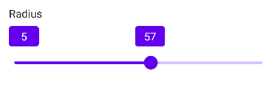
Let's look at how we can configure this, but before we do that let's look at the default Slider implementation. The SliderThumb is the blue circle in the above screenshot and the Track is the line on which the thumb is being tracked to a certain position.
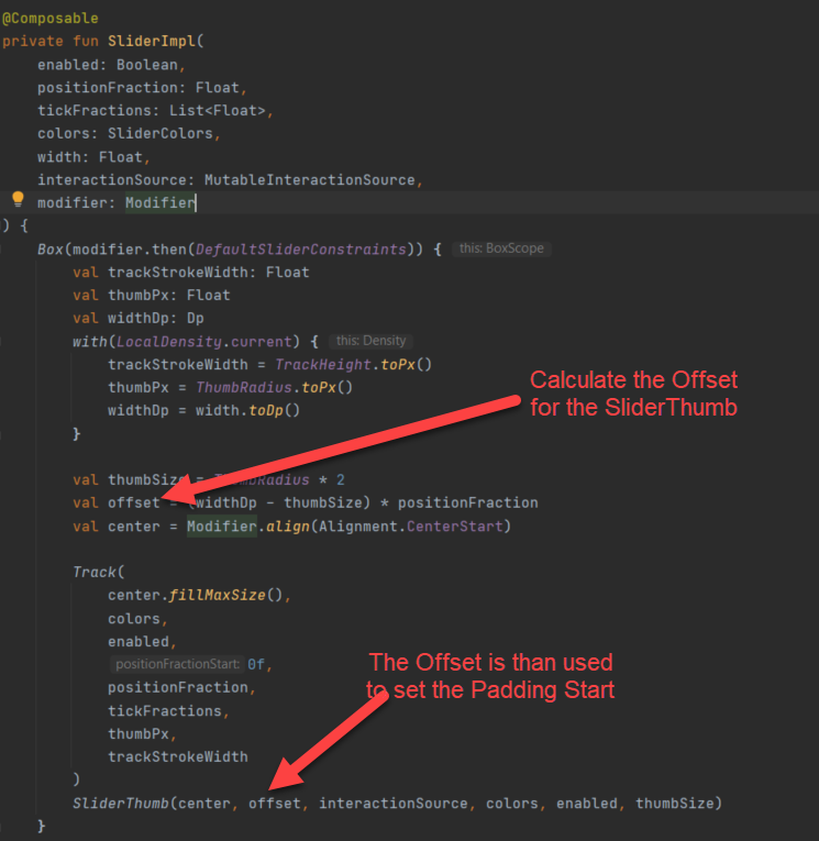
For our label to appear exactly on top of the SliderThumb, we need to mimic how the offset is being calculated for the SliderThumb and just position our text to use the same. Here is the layout we will use to achieve this behavior.
Overview
Here is an overview of the process:
- Define the SliderLabel Composable
- Configure the Labels in BoxWithConstraints layout to determine the total width
- Calculate the Offset based on Value, ValueRange, and Width
- Set offset on the end label
- Use Column layout to stack the Box on top of the Slider control
Define the SliderLabel Composable
We will use a composable function to use for styling the Start and End Labels. We will call it SliderLabel and implement it as below
@Composable
fun SliderLabel(label: String, minWidth: Dp, modifier: Modifier = Modifier) {
    Text(
        label,
        textAlign = TextAlign.Center,
        color = Color.White,
        modifier = modifier
            .background(
                color = MaterialTheme.colors.primary,
                shape = RoundedCornerShape(4.dp)
            )
            .padding(4.dp)
            .defaultMinSize(minWidth = minWidth)
    )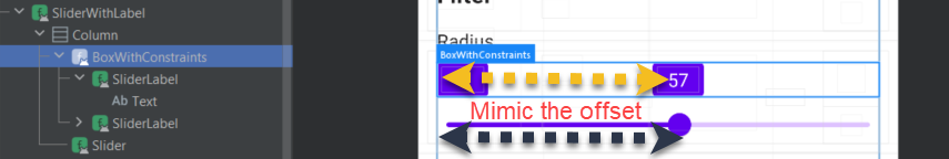
}Configure the Labels in BoxWithConstraints layout to determine the total width
We will now position the labels inside the BoxWithConstraints layout. The advantage of this layout is we can access the maxWidth property that this box will occupy. And, since we specify the BoxWithConstraints to take up the maximum width using the fillMaxWidth modifier, this will indicate the true width of the Box layout.
BoxWithConstraints(
    modifier = Modifier
        .fillMaxWidth()
) {

    val endValueText =
        if (!finiteEnd && value >= valueRange.endInclusive) "${
            value.toInt()
        }+" else value.toInt().toString()


    SliderLabel(label = valueRange.start.toInt().toString(), minWidth = labelMinWidth)

    if (value > valueRange.start) {
        SliderLabel(
            label = endValueText, minWidth = labelMinWidth, modifier = Modifier
        )
    }
}
In addition to the width, we also use the parameter finiteEnd(we will expose this in our final Composable function) to determine if we need to suffix + to the endValueText which might be useful in certain cases for visual purposes to the end-user when there could be more values than the current end value.
Calculate the Offset based on Value, ValueRange, and Width
Now that we have the width, we are ready to calculate the offset needed for the end label to match with the SliderThumb.
What we are doing here is, given the current value of the slider on the Track line and if we consider the width of the entire track line on a scale of 0 to 1(kind of like 0 to 100 percent) for the value range specified, what is the value of the current position.
/*
 * Copyright 2019 The Android Open Source Project
 *
 * Licensed under the Apache License, Version 2.0 (the "License");
 * you may not use this file except in compliance with the License.
 * You may obtain a copy of the License at
 *
 *      http://www.apache.org/licenses/LICENSE-2.0
 *
 * Unless required by applicable law or agreed to in writing, software
 * distributed under the License is distributed on an "AS IS" BASIS,
 * WITHOUT WARRANTIES OR CONDITIONS OF ANY KIND, either express or implied.
 * See the License for the specific language governing permissions and
 * limitations under the License.
 */


// Calculate the 0..1 fraction that `pos` value represents between `a` and `b`
private fun calcFraction(a: Float, b: Float, pos: Float) =
    (if (b - a == 0f) 0f else (pos - a) / (b - a)).coerceIn(0f, 1f)
Note: The above formula is copied from the default implementation.
When we get this value, we then multiply it by the total width minus the width of the end label and any padding the label occupies. This will give us the offset. Here is the formula to calculate this.
private fun getSliderOffset(
    value: Float,
    valueRange: ClosedFloatingPointRange<Float>,
    boxWidth: Dp,
    labelWidth: Dp
): Dp {

    val coerced = value.coerceIn(valueRange.start, valueRange.endInclusive)
    val positionFraction = calcFraction(valueRange.start, valueRange.endInclusive, coerced)

    return (boxWidth - labelWidth) * positionFraction
}
Set offset on the end label
Let's use the formula we have defined and update our end label code to include the offset in the padding.
BoxWithConstraints(
    modifier = Modifier
        .fillMaxWidth()
) {

    ...

    val offset = getSliderOffset(
        value = value,
        valueRange = valueRange,
        boxWidth = maxWidth, //accessed directly as property from the BoxWithConstraints
        labelWidth = labelMinWidth + 8.dp // Since we use a padding of 4.dp on either sides of the SliderLabel, we need to account for this in our calculation
    )


    if (value > valueRange.start) {
        SliderLabel(
            label = endValueText, minWidth = labelMinWidth, modifier = Modifier
                .padding(start = offset)
        )
    }
}
Use Column layout to stack the Box on top of the Slider control
The last step is to stack our labels on top of the actual Slider control using the Column layout.
Column() {

    BoxWithConstraints(
        modifier = Modifier
            .fillMaxWidth()
    ) {

        ...
    }

    Slider(
        value = value, onValueChange = {
            onRadiusChange(it.toString())
        },
        valueRange = valueRange,
        modifier = Modifier.fillMaxWidth()
    )

}
At this point, we have everything in place, let's wrap our code in a composable function SliderWithLabel that we can reuse in our app as needed. Here is the complete code for this implementation.
@Composable
fun SliderWithLabel(
    value: Float,
    valueRange: ClosedFloatingPointRange<Float>,
    finiteEnd: Boolean,
    labelMinWidth: Dp = 24.dp,
    onRadiusChange: (String) -> Unit
) {

    Column() {

        BoxWithConstraints(
            modifier = Modifier
                .fillMaxWidth()
        ) {


            val offset = getSliderOffset(
                value = value,
                valueRange = valueRange,
                boxWidth = maxWidth,
                labelWidth = labelMinWidth + 8.dp // Since we use a padding of 4.dp on either sides of the SliderLabel, we need to account for this in our calculation
            )

            val endValueText =
                if (!finiteEnd && value >= valueRange.endInclusive) "${
                    value.toInt()
                }+" else value.toInt().toString()


            SliderLabel(label = valueRange.start.toInt().toString(), minWidth = labelMinWidth)

            if (value > valueRange.start) {
                SliderLabel(
                    label = endValueText, minWidth = labelMinWidth, modifier = Modifier
                        .padding(start = offset)
                )
            }
        }

        Slider(
            value = value, onValueChange = {
                onRadiusChange(it.toString())
            },
            valueRange = valueRange,
            modifier = Modifier.fillMaxWidth()
        )

    }
}


@Composable
fun SliderLabel(label: String, minWidth: Dp, modifier: Modifier = Modifier) {
    Text(
        label,
        textAlign = TextAlign.Center,
        color = Color.White,
        modifier = modifier
            .background(
                color = MaterialTheme.colors.primary,
                shape = RoundedCornerShape(4.dp)
            )
            .padding(4.dp)
            .defaultMinSize(minWidth = minWidth)
    )
}


private fun getSliderOffset(
    value: Float,
    valueRange: ClosedFloatingPointRange<Float>,
    boxWidth: Dp,
    labelWidth: Dp
): Dp {

    val coerced = value.coerceIn(valueRange.start, valueRange.endInclusive)
    val positionFraction = calcFraction(valueRange.start, valueRange.endInclusive, coerced)

    return (boxWidth - labelWidth) * positionFraction
}


// Calculate the 0..1 fraction that `pos` value represents between `a` and `b`
private fun calcFraction(a: Float, b: Float, pos: Float) =
(if (b - a == 0f) 0f else (pos - a) / (b - a)).coerceIn(0f, 1f)Hope this helps with enhancing the Slider layout to show the labels in your implementation. Happy Composing!